From the new color to the new logo: / slash becomes SLASH. In addition to the SLASH logo, all advertising material has also been redesigned. In the two-tone design, geometric elements and amorphous shapes meet detailed illustrations with numerous references to classics from Fantastic Film. At the same time, the new design pays homage to the VHS era and its now iconic aesthetics, which can be seen in the typography, for example.
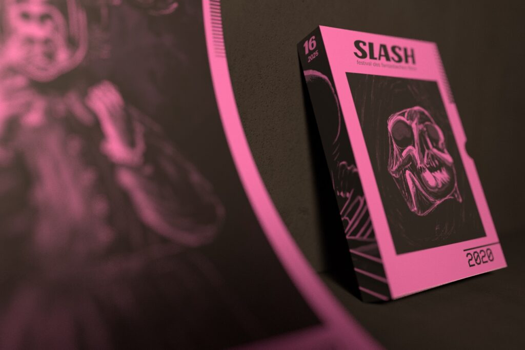
»Over the past ten years, SLASH has developed organically: a film show founded by students has become a festival of international importance. We are now taking this into account with a new appearance, which combines analogue romanticism with a modern design« explained Markus Keuschnigg, art director of the SLASH film festival. The main cornerstone of the redesign is the new color spectrum of six colors that change every year. Every year a different color in combination with black characterizes all advertising material at the festival. The year 2020 is bathed in spooky fuchsia.
Conception & Design: HYPHE
Trailer: HYPHE
Sound: Wolf&Antelope, Jennifer Gitschner
Client: SLASH Filmfestival
The playful character of the new design is not only evident in the color scheme: we have even come up with a special goodie: a designed slipcase in which you can collect the print forms from the respective year.
The SLASH website is also designed in monochrome fuchsia and black this year.
A key feature of this project was the self-illustrated trailer, which was supported by another customer of ours with sound production.